
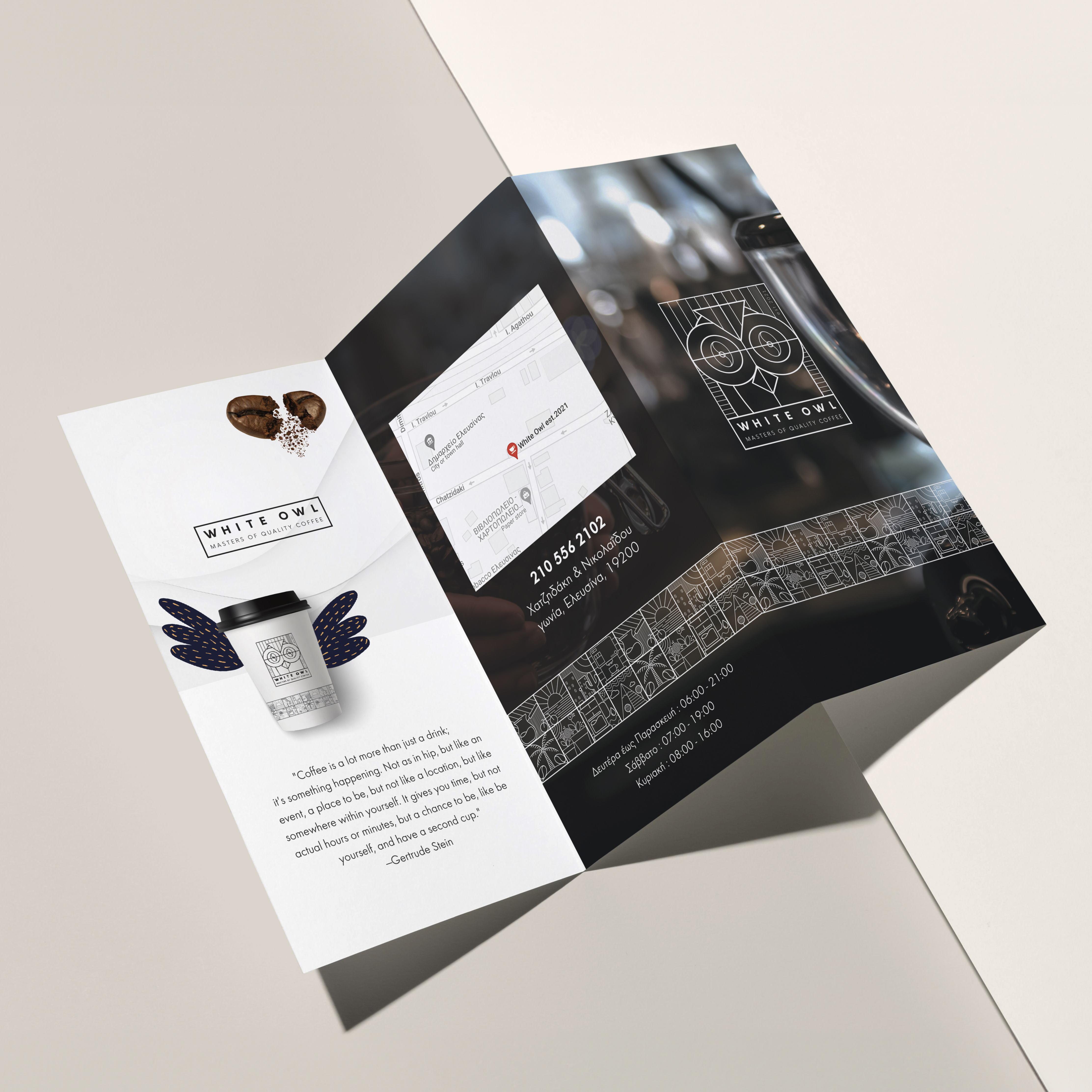
A carefully structured print piece extending the coffee shop’s distinctive visual world.
For White Owl, we designed a promotional flyer that brings together the brand story, product imagery, contact information and location within one clear composition. The established owl geometry and custom coffee icons continue across the layout, making the flyer immediately recognisable as part of the wider identity.
Strong contrast, precise alignment and a restrained palette create visual impact while keeping the practical information easy to find. The result is a polished communication tool that introduces both the character of the brand and the experience customers can expect.