
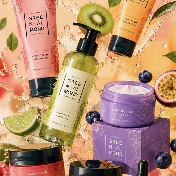
A clean and refined identity where botanical origins meet contemporary skincare.
Green Almond creates nature-inspired cosmetics, so the brand needed an identity that would communicate purity, care and the value of natural ingredients without feeling predictable. The compact typographic logo breaks the name into a carefully balanced structure, giving it a distinctive rhythm while maintaining a minimal and contemporary aesthetic.
Delicate botanical illustrations introduce the natural world behind the products, while the clean white packaging and deep green details suggest freshness, quality and trust. The result is a cohesive identity that feels gentle yet professional, helping Green Almond stand confidently within the modern cosmetics market.