
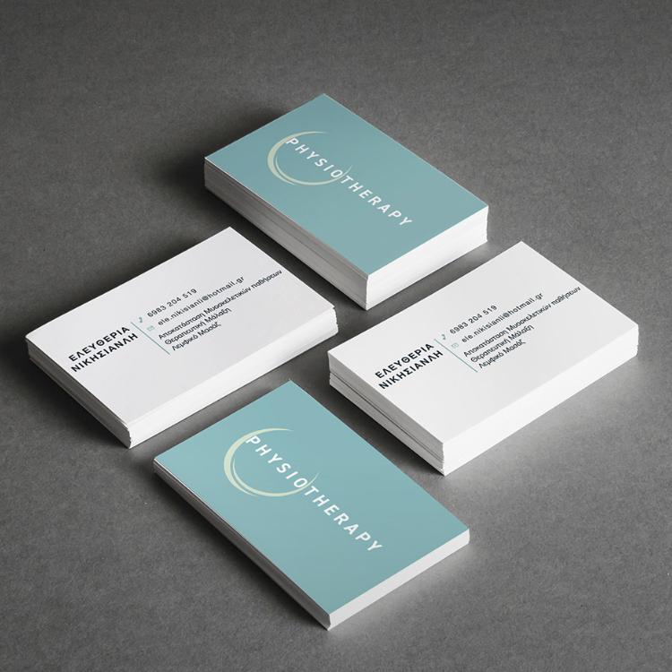
A balanced visual identity connecting the body’s structure with movement, therapy and natural recovery.
For a Physiotherapist, we created a calm and contemporary identity that reflects the practice’s focus on physical health, rehabilitation and improved movement. The circular form gives the logo balance and continuity while visually separating and emphasising the word “Physio,” making the practice’s field immediately clear.
The smaller circles arranged within the design subtly reference the vertebrae of the spine, bones, joints and the individual points addressed during physiotherapy. Their repetition creates a gentle sense of movement and connection throughout the body. Combined with natural turquoise tones, the result is a clean and reassuring identity that communicates wellbeing, professional care and gradual recovery.