
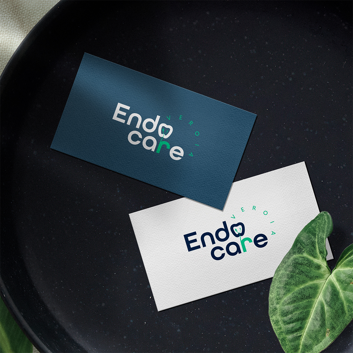

A calm and precise visual identity designed to inspire trust in specialised dental care.
Endodontic treatment can naturally make patients feel anxious, so Endo Care needed an identity that would communicate expertise without appearing cold or overly clinical. We developed a minimal typographic logo with carefully considered details, balancing medical precision with a calmer and more approachable character.
The letter “r” continues into an organic, branching form inspired by a tree—a symbol associated with nature, health and renewal. At the same time, its delicate branches reference the complex root canals inside a tooth, the precise area an endodontist specialises in treating. This subtle visual connection gives the logo meaning without compromising its minimal character.
The monochrome visual system extends naturally across business cards and professional materials, giving the clinic a consistent and recognisable presence. The result is an understated identity that reflects specialised knowledge, attention to detail and dependable patient care.